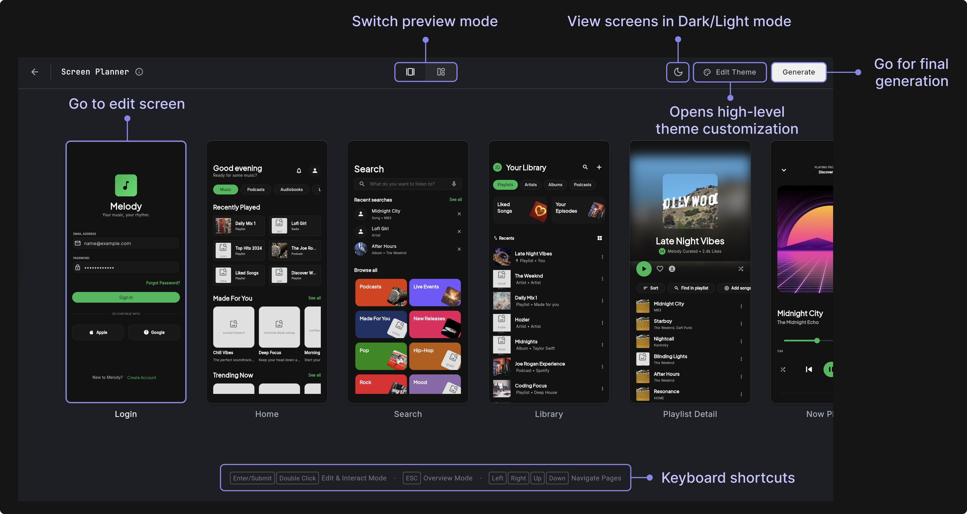
Screen Planner
The Screen Planner lets you clarify your app idea before AI generation begins. This planning step gives you better control over the outcome by allowing you to refine screens, flow, and high-level intent upfront, resulting in a more accurate and predictable final app.
Screen Planner helps you:
- Confirm which screens will be generated initially
- Adjust the visual theme at a high level
- Review the page structure and navigation flow
- Reduce rework by aligning the final result to your intent from the start
The previews in Screen Planner are intentionally simplified to focus on structure and flow. Your generated app will include more detail, interactions, and polish.
Using Screen Planner
Here’s how you use a Screens Planner:
- On the dashboard prompt box, enable the Plan Screens toggle, then submit your prompt to open the Screen Planner.
- Review the proposed screens.
- Double-click a screen to enter Edit Mode.
- To add a new screen, navigate to the last screen in the sequence and click Add Screen.
- If needed, use Edit Theme to adjust high-level styling before generation.
- Click Generate to build your app based on the finalized screen plan.
Page Editor
The Page Editor allows you to refine and adjust individual screens. If a feature is wrong or missing at this stage, fixing it later can require structural changes.
Editing screens before generation helps you:
- Remove features you don’t plan to support
- Add missing core features
- Split one overloaded screen into two
- Adjust navigation flow
- Reduce rework after generation
This is where you make high-impact decisions that shape the structure of your app. If something essential is missing, add it before generating. For example:
- Add Apple Sign-In to the Login screen
- Add a Settings icon to the AppBar that navigates to a Settings page
- Remove the Favorites tab from this page
- Add search functionality to the page
- Convert a tab-based layout into a single-page layout
These types of changes impact navigation, routing, state management, and sometimes data models. Including them before generation ensures they’re properly wired from the start and avoids structural refactoring later.
- Does this screen include all the essential features?
- Is anything unnecessary or out of scope?
- Does this reflect the actual product I want to build?
- Is the user flow clear and correct?
- Are any key integrations missing (such as Apple Sign-In, analytics, or search)?
If the change affects what gets built, connected, or wired, make it now. If it only affects visual styling or layout details, you can handle that using Edit Theme.
Theme Editor
The Theme Editor allows you to make high-level visual adjustments to your app before generation. Instead of editing individual widgets, you define global design rules that apply consistently across all screens.
This is ideal for setting your brand foundation before code is generated. Using Theme Editor, you can control the following:
- Preset (Theme Dropdown): Allows you to select or switch between available theme presets, including the generated base theme.
- Typography: Defines the global font system by setting primary, secondary, and optional mono fonts that apply consistently across all screens.
- Brand: Controls core brand colors such as primary, secondary, accent, and their lighter variants, which influence buttons, highlights, and interactive states.
- Backgrounds: Sets the main screen background, alternate background, and card surface colors to establish contrast, layering, and visual depth.
- Text: Configures primary and muted text colors to maintain proper hierarchy, readability, and accessibility throughout the app.
- Feedback: Defines system state colors such as error and its lighter variation to ensure consistent validation and alert styling.
- Spacing: Adjusts global layout density to make the interface feel more compact or more spacious across all screens.
- Corner Radius: Controls the rounding applied to components like buttons, cards, and inputs to shape the overall design language.
- Text Size: Applies a global text scale multiplier to improve readability and proportion across the entire application.