Theme
The Theme panel in Dreamflow provides a centralized way to manage the visual identity of your app. Instead of hardcoding styles in multiple places, you can define colors, typography, style, and size values once and reuse them consistently across your project. This ensures your app maintains a polished, cohesive look while making design updates faster and easier.
You can navigate to the Theme panel by clicking the theme button in the left side rail. Values defined in your Theme panel are accessible within the property editor. For example, theme colors are accessible in the color picker when setting a color property.
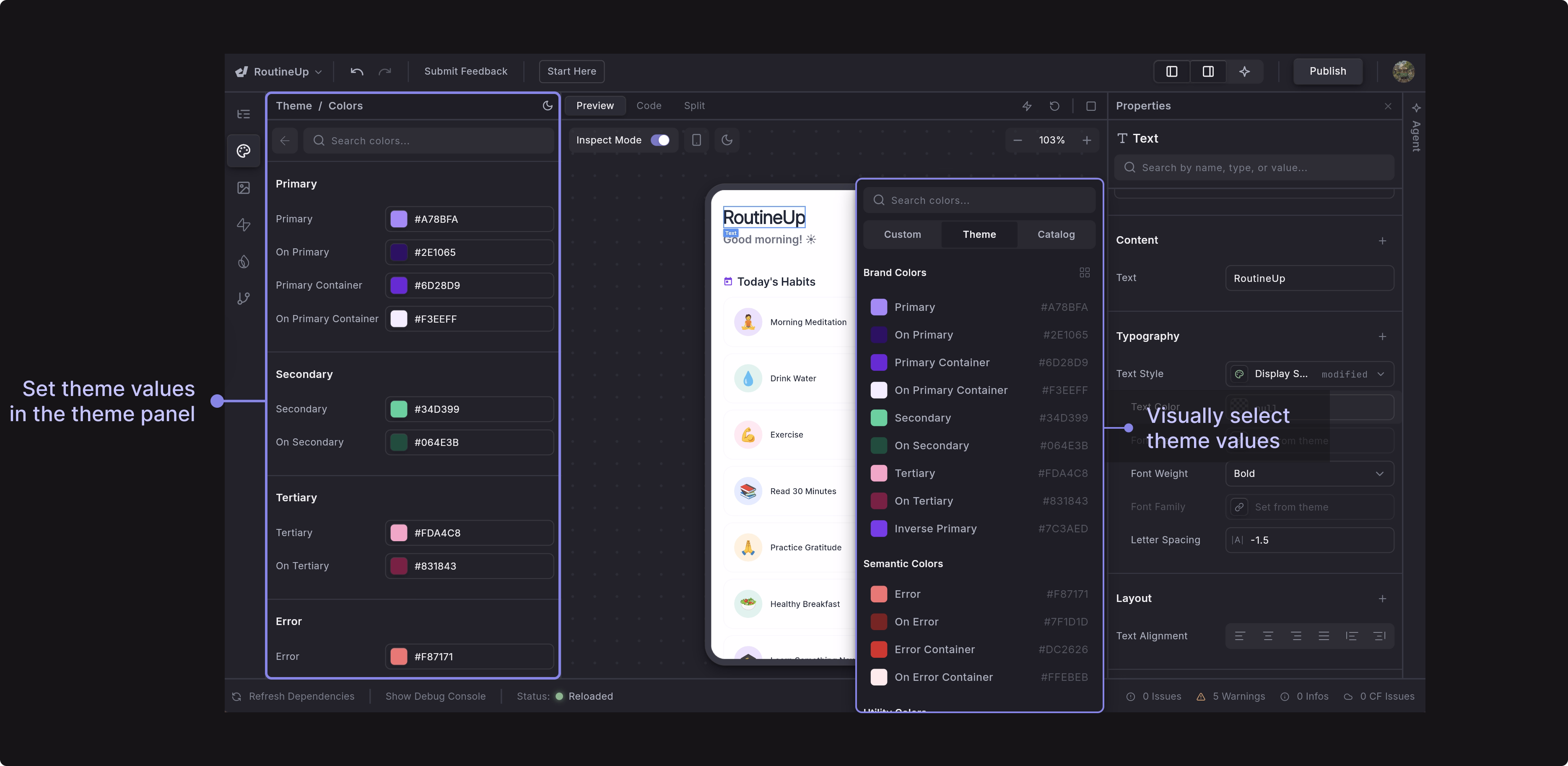
The Theme module is powered by AI and works directly with your existing theme code. It doesn’t require a specific structure or strict patterns. Whether you’re using standard Material themes, custom theme classes, or your own organization style, the Theme panel understands it and provides type-aware editors for colors, typography, and style values.
When you update your theme files, the Theme module automatically refreshes to reflect those changes, so everything stays in sync.
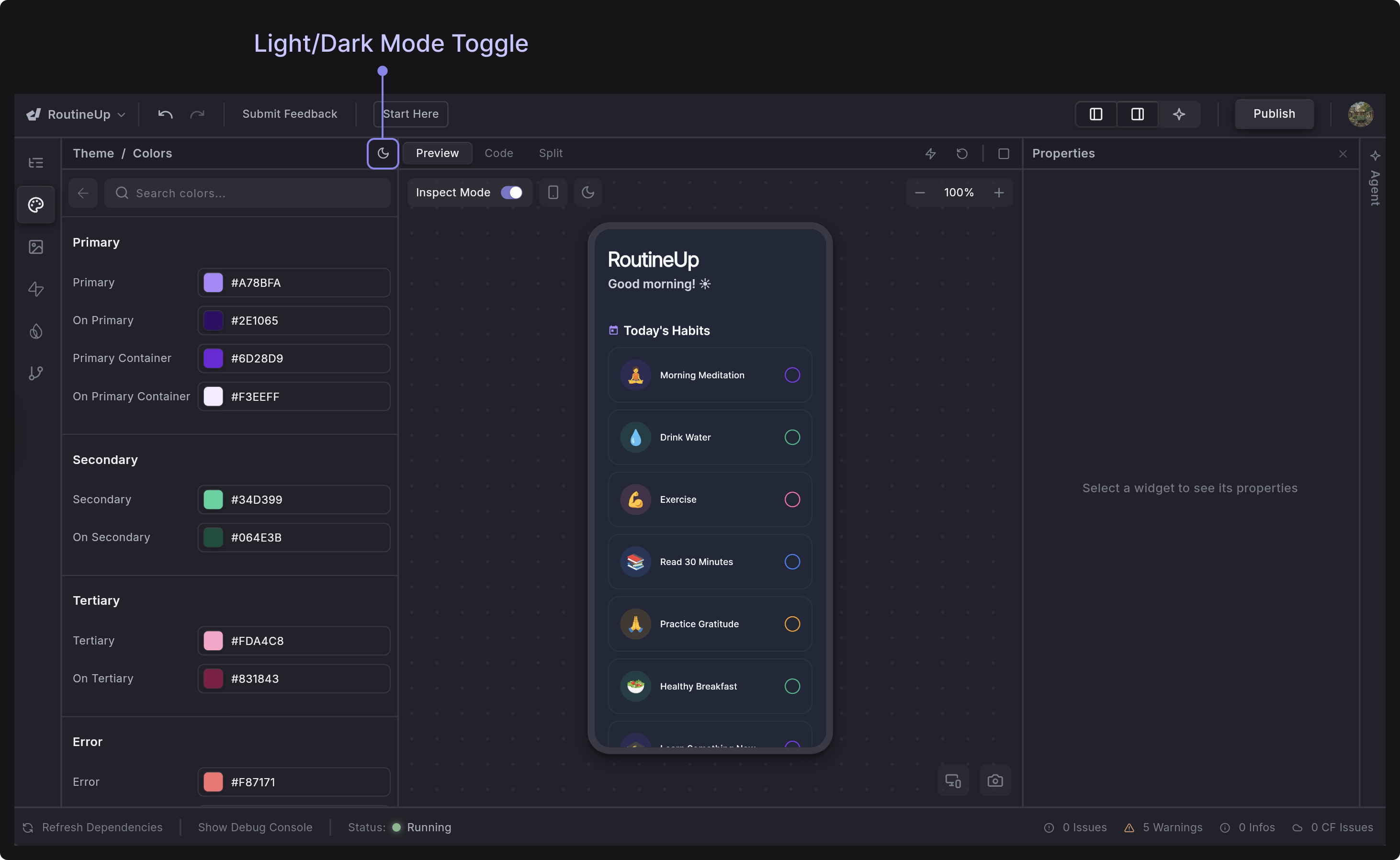
Switch Theme Mode
Dreamflow makes it easy to design and preview your app in both Light Mode and Dark Mode. In the Theme panel, you can select Dark Mode from the toggle icon. When you switch modes, Dreamflow automatically applies the corresponding color palettes, allowing you to check readability, contrast, and overall aesthetics in real time.
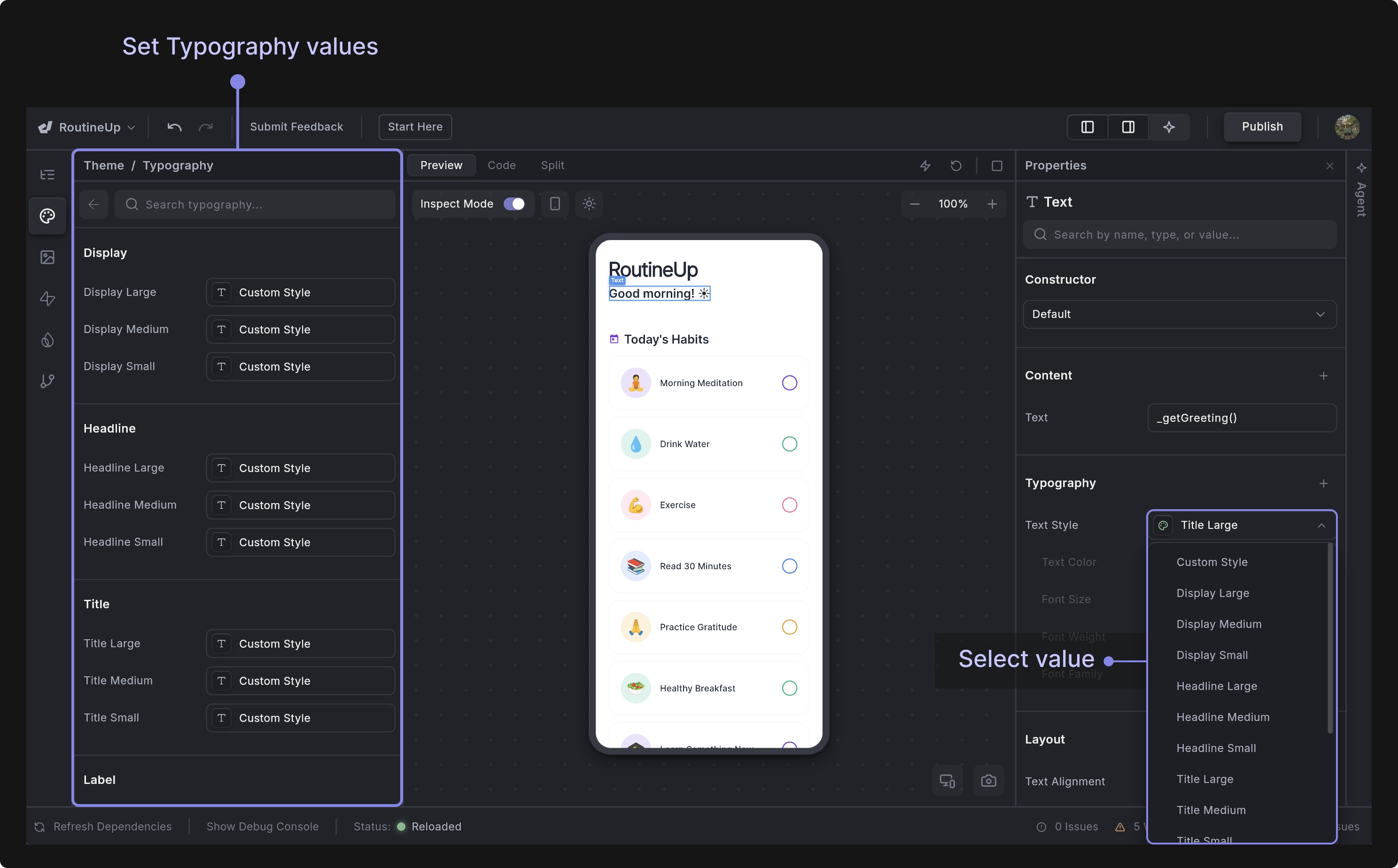
Typography
Typography in Dreamflow ensures that text styles remain consistent throughout your app. It is divided into categories that map to different use cases:
- Display: Large, prominent text for headers, hero sections, or landing screens.
- Headline: Sub-headers or secondary emphasis text.
- Title: Standard section titles and key labels.
- Body: Paragraphs, descriptions, and content-heavy areas.
- Label: Smaller text for buttons, captions, or UI labels.
You can modify your text styles in the Theme > Typography section and then use them anywhere a TextSyle class is expected - for example, in the Text Style property of the Text widget.
Sizing Sections
- Spacing Values: Defines the core spacing scale (such as XS, SM, MD, LG) used across the app for padding, margins, gaps, and layout spacing.
- Edge Insets Shortcuts: Provides reusable padding and margin presets built from spacing values.
- Horizontal/Vertical Padding: Defines standardized padding presets applied symmetrically, commonly used for buttons, cards, inputs, and containers to avoid inconsistent spacing.
- Border Radius: Defines reusable corner radius values.
- Font Sizes: Defines the numeric font size scale used by text styles.
Best Practices
To get the most out of Dreamflow’s color system, keep these guidelines in mind:
- Maintain contrast: Always ensure sufficient contrast between foreground (text/icons) and background colors for accessibility.
- Be consistent: Use brand colors consistently for key elements such as buttons and text so users quickly learn their meaning.
- Leverage semantic colors: Don’t reinvent error, warning, or success colors; stick to semantic definitions for clarity.
- Test both modes: Always check your design in Light Mode and Dark Mode to ensure readability and visual harmony.
- Avoid color overload: Use a limited palette so your app feels cohesive rather than chaotic.